Flutter Entertainment Plc, the global business behind brands such as Paddy Power, FanDuel, Sky Bet and Betfair has opened its €15.5 million global headquarters in Dublin, providing a truly stand-out destination office for a progressive and people-orientated business
Totalling 164,000 sq. ft, spread across seven floors, the office in the Dublin-suburb of Clonskeagh now offers a breadth of experiences, facilities and opportunities to appeal to the typically digital talent on which its business depends.
Home to 1,700 employees working in sports trading, technology, product development, innovation, marketing, HR, and customer-facing roles – the new office is a perfect example of how design can encourage people back into the workplace and facilitate hybrid working. The building includes 110 meeting spaces, 227 agile spaces and 1,070 seated positions. Despite COVID halting construction work in Ireland for four months, the project was completed six weeks ahead of the altered schedule.
UK-based interior design and fit-out business Claremont had the task of helping Flutter realise its vision for a collaborative, sociable, knowledge-led and desirable workplace – a project that has been its most ambitious and challenging to date. More than three years in the making, it called on all aspects of Claremont’s expertise, from workplace consultancy through to interior design, fit-out, furniture and AV.
Ken Bundy, who’s designed numerous compelling interiors for big brand employers over the last 30 years, led the project.
He said: “We started working with Paddy Power, one of Flutter’s brands, back in 2018 with a workplace consultancy project centred on helping to establish its teams’ spatial needs in London, Yorkshire and Ireland. As our relationship developed and we learned that Flutter wanted to rethink its Dublin presence, we knew there was opportunity to create something quite special – a true destination workspace that would be rich in social interaction, team-work and crucially – fun.
 “Of course, we also had to adapt to the shifting demands of the pandemic – in particular to reflect hybrid working. Because of that, we knew the office needed to offer the experiences that home-working just couldn’t. We knew our design had to encourage people back into the workplace.”
BUILDING CHALLENGE
But before thought could be given to the interior of the new HQ and how its occupants would use the space, the very fabric of the 1960s red-brick, corridor-led and U-shaped building required an overhaul.
Bundy said: “The original building was rife with limitations. Most of its usable spaces were centred around narrow corridors and the shape of the building meant it promoted separation, rather than unity. Our vision was to add square footage to the building so that we could create deeper floorplates which, in turn, would offer more usable space and the ability to unify different departments and areas with ease.”
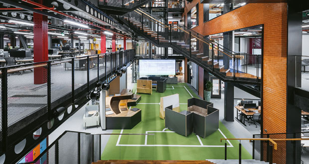
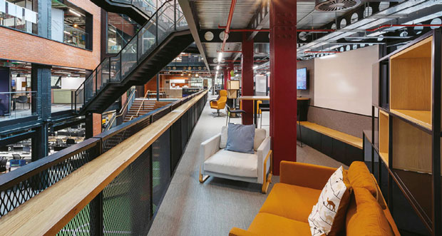
Claremont’s plan was to add a new glazed atrium to the front of the building – which has resulted in the building being 72 per cent glazed. The addition of this architectural feature has effectively filled in the building’s U-shaped footprint, transformed its façade and added 33,987 square feet to the building. This space serves a variety of very important purposes. It offered space to create the on-brand welcome Flutter wanted – with a ground floor football pitch, complete with football tunnel and pitch-side bleacher style seating. It also created space to address connectivity and movement throughout the building – which was achieved with the addition of four custom-designed, zig-zag industrial style staircases to connect the seven floors together.
Bundy said: “The atrium has vastly improved the building’s connectivity and sense of cohesion. It gave us the space to add these impressive walkways – while they certainly deliver a visual wow, they are crucial to creating frictionless movement between the floors. And, thanks to the widespread use of glass, the atrium also offers visual links to all floors. By adding just this space – it’s unlocked the value of the building as a whole.”
Built to exacting environmental standards, the newly renovated building also includes a range of accessibility and sustainable features which aim to make the work environment healthier for colleagues, while also reducing the carbon impact of the building. Some of its most unique features and facilities include intuitive A-rated air conditioning and a cascading watering heating system, solar-gain thanks to the widespread use of glass and a live green roof which includes three hives supporting thousands of bees. The honey produced is even available at some of Flutter’s on-site dining areas.
Bundy added: “Flutter could have walked away from this building in favour of something easier and that didn’t need so much work to the building’s envelope. But they chose to be brave and progressive. The end result shows what a bold vision and a fresh approach to space can do for a business and also, how it is the occupier that really brings a space to life.”

