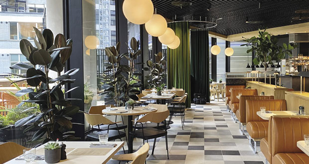
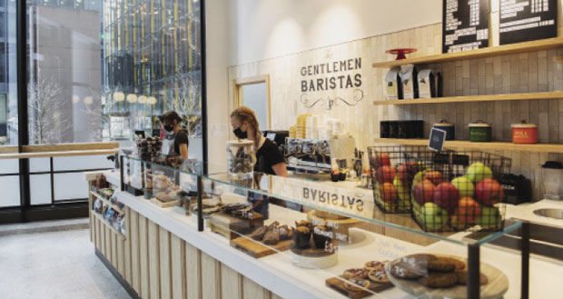
FMJ views the Market, the new food and dining areas on level two at 22 Bishopsgate to learn how award-winning studio DesignLSM has created the perfect space for new ways of working
Workplace catering has taken a huge hit over the past 18 months, so it is heartening to hear about the unveiling of a stylish refreshment and social area on Level 2 of 22 Bishopsgate, the City of London’s newest 62-storey office building. Award-winning studio DesignLSM devised the interior design for the food and dining areas of the building, which was developed by Lipton Rogers Developments on behalf of the investment managers Axa and an international consortium of investors.
Covering 1.5 million square feet of space, which can accommodate a community of up to 12,000 residents and visitors, 22 Bishopsgate was designed by Karen Cook of the architects PLP. It offers tenants a range of office spaces and a variety of shared spaces for eating, fitness, learning, wellbeing and socialising. It is also the first building in the UK to apply for the WELL Building Standard. This includes triple-glazed windows, which not only increase the energy efficiency of the building but also reduces noise and boosts the level of natural daylight by 60 per cent, reducing the need for internal lighting and providing a healthier environment.
‘The Market’ food and dining areas on Level 2 was created by Karen Taylor, DesignLSM’s Design Director, who has over two decades of experience in creating exceptional hospitality experiences. DesignLSM was established in 1988 and is a multi-disciplined studio that specialises in Strategy, Branding, Architecture, and Interior Design within the hospitality sector.
Working with Amy Morris of Morris Project NYC, the team came up with the aesthetic for the space, which draws on the crafted ethos of the London guilds. Before determining the design solution for the 20,000 sq ft space, however, the design team consulted with caterer’s Rhubarb to define exactly how the space would be used.
Says Taylor: “This building is amazing which is why we welcomed working on this incredibly iconic project, as well as having the opportunity to create a concept that speaks to the modern tenants of this building whilst also reflecting the area’s commercial heritage. Part of our process is understanding the location and the demographics right at the beginning, before the design stages, to discover what people actually need and want from the space and how they will use it.
“People will be coming in – hopefully day in day out – so it was important to approach it from the customer point of view. We wanted to create a space suited for meeting and gathering – it needed to work for all parts of the day. Another key aspect that was important right from the beginning was to create somewhere timeless, a place where people will want to come back to day after day and which in five-year’s time will continue to feel like their community hub.”
SOCIAL SOLUTION
The Market is so much more than a corporate catering space. It houses a restaurant, a food market which comprises four kiosks (with one of the kiosks being a rotating concept that will be selected by the tenants quarterly), an external terrace, a culture space and a ‘Speakeasy’ that can support a mixed programme of music, talks and private events.
Explains Taylor: “The finished project reflects our overall vision, with the key elements being to create a community, a timeless interior and also a space that fitted with the overall vision of 22 Bishopsgate. Even though the fit out didn’t need to emulate the rest of the building we wanted to reflect that aspect and how the food is in line with the wellbeing ethos, which were key elements.
“It’s a large space to fill so we worked very closely with Rhubarb to learn what their operational vision was, from the type of food on offer to the number of kiosks. Before we could do anything on plan we needed to understand how this space was going to be used. What is the customer journey, from the morning to the afternoon and into the evening; from 11am coffee, lunchtime to mid-afternoon? What will be served and where? That helped us begin to create zones and work out the footfall, including the first part people see coming in and where they’ll be drawn to.”
Entering the space from the lifts you’re struck by the welcoming “local area” which is ideal for social gatherings, operating effectively as somewhere to grab a coffee with colleagues in the morning to a place where people can congregate in the evening. The bar area even includes a wine tasting table with views out towards the city.


