DESIGN VISION
The main success of the Market is the fact that despite it being a large space to fill, visitors are drawn into the space and once there can choose from a number of areas to socialise, work or simply contemplate the view.
“In the middle of the day there’s an area where you get a splash of sunshine so people like to sit in that space”, says Taylor. “In mid-winter with the sun coming down Threadneedle Street you can just sit and watch.”
It took some careful planning to ensure the space wasn’t too imposing, for as Taylor explains: “We had the challenges of designing for essentially what is a long rectangular box which is glazed on one side. This is why we came up with the idea of arches to break up the long expanse of wall. That feeds life into the rest of the space. When people enter out of the lift they will hear the buzz of the kitchen which is open plan and the smell will help entice them in.”
Another hugely important element of the design was to create a sense of community. This is why the finished look captures the crafted ethos of London guilds. There were once close to 90 guilds based mostly in the inner city with their purpose being to offer welfare to their members and a place to gather and share ideas. After years of decline these urban guilds have experienced a revival in recent years and the design for Level 2 seeks to emulate their objectives, encouraging the development of community while supporting collaboration and discovery.
This rests on a range of bespoke murals – each one seen as an individual painting – coupled with the use of natural materials, soft natural plaster and oak arches communicate a sense of balance and harmony, allowing guests to come together for shared experiences.
“Relating it to the London guilds and the idea of why the guilds were started which was about welfare and creating a community, all made sense,” says Taylor, “and it helped to create a foundation for the design of the project which saw us through until the end.”
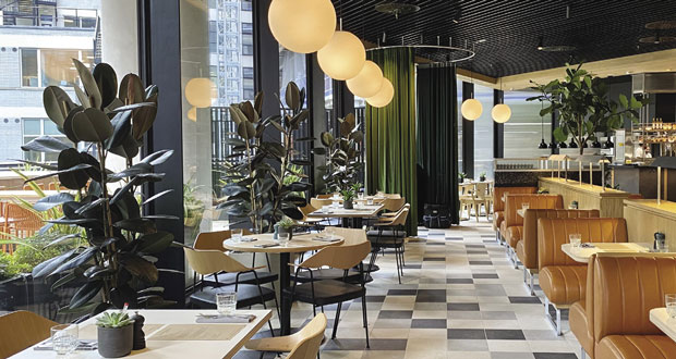
The furniture also brings some fresh design elements into the second floor, including some beautiful pieces of crafted furniture such as the Lightwood Stools, designed by British designer Jasper Morrison and manufactured by Maruni. These are designed in a range of heights depending on whether you choose to sit up at a bench or a table and seating choices include an updated design version of the 675 Robin Day Chair for the restaurant area. A range of bespoke natural solid oak joinery items, particularly some charming rectangular benches lends a collaborative feel to the space.
According to Taylor much of the solution was achieved by working closely with the US team, who helped bring another dynamic into the mix. “We built up an amazing working relationship with Amy who, like us has a strong branding as well as interiors background. The amazing thing was we were both in line with our vision and tastes. Like me she’s got a strong draw to vintage furniture so for instance, we agreed that the Jasper Morrison stools are timeless. We also had an architect in our office to contribute to ideas, so with all of those disciplines we all brought something to the table.”
The restaurant area was designed as a separate space and features an open plan kitchen where you can see the chefs at work. It boasts a neutral colour palette interspersed with subtle brown hues with the muted tones referencing the Heraldic emblems of the guilds. The most tranquil space on the floor is the speakeasy, which is designed as a stark contrast to the well-lit, contemporary dining space. It has the feel of a member’s club and with views of the nearby streets, including a thirteenth century church, offers tenants a wholly intimate and sublime environment – from daytime contemplation to evening socials.
LIGHT AND TECH
The approach to lighting took a modern interpretation to a timeless and classic design, and features a choice of high feature lighting and fittings supplied by Firefly Lighting. The carpentry supports the way the different styles of lighting reflect the area being lit, for example whether task lighting within booths or softer warmer glows in the social spaces.
Says Taylor: “We worked on the premise that good lighting can make you feel a certain way, which is all part of the wellbeing element and why it was important that people felt tranquil in this space. This mixture of lighting and layout means that people can come here any time and have a feeling of calm which is difficult to achieve in such a really big place.”
Bringing together a diverse range of tenants, from the finance, legal, design and engineering spheres with those of companies occupying the flexible workspaces is another important area of the concept, which is why the use of technology is integral to the space.
There is an app for tenants to pre-order teas, coffees and lunch orders, which they can key in on their way to work. Tenants can order food to be delivered and view the app to see what events are taking place within the space.
Says Taylor: The tech also helps create the feeling of a market community. We’ve also installed USB slots everywhere in the space which can be replaced if the tech changes. Food and drink is also cashless which interestingly, when I started on the project three years ago, was deemed unusual. Overall through this technology the space is incredibly user friendly and offers a lot of ways of being integrated into the community.”
FIT FOR THE FUTURE
Given the level of uncertainty created by the pandemic, it was crucial that the finished design, while timeless, also lends itself to flexibility. For instance, the retail carts are on massive castors so can be moved around to offer different snacks dependent on the day’s theme. Taylor, who is pleased how well Level 2 complements the overall ethos of 22 Bishopsgate, continues to have conversations with caterers Rhubarb to harness the flexibility of the Market’s overall design.
 “We know that workspaces are changing and offices are consolidating” she says. “If an organisation has an estate with ten offices they might just have the headquarters with 60 per cent capacity for their workers, with people only going in on certain days.
“This kind of space is going to be even more important as offices change tack. Whether people have meetings or are experiencing a very stressful day in the office, it’s important to offer more intimate spaces. Places to sit together for a team meeting, spaces where you can have a glass of wine after work, spaces where you can meet visitors from outside the organisation and that is why the flexibility we offer here is absolutely key.”


